behind the scenes of amika’s holiday campaign
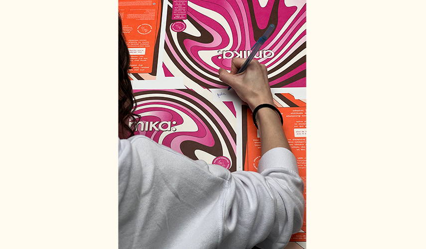
ICYMI, our holiday theme this year pays homage to the decade of disco–the ’70s! We went behind the scenes with our creative team to hear more about the process behind our packaging, and the inspiration behind the theme.
We chatted with the two of the brains behind this operation—amika Intermediate Designer of Packaging & Visual Merchandising Jaden McMahon, and Associate Art Director of Packaging and Visual Merchandising Morgan Bourdeau. Both had a very heavy hand in the holiday process: coming up with the theme, designing the packaging, and creating an overall collaborative and creative experience. Keep reading to see our chat with them!
for a campaign as iconic as Holiday, what’s your process for brainstorming themes? is it all based on what’s trending, or do you try and look elsewhere for inspiration?
“For holiday this year, it was different than we usually go about it. The concept of the ’70s was something we were itching for, and something we always came back to” say Morgan and Jaden. “At the beginning of our process, we sat down and dove into every corner for inspiration. Home décor, fashion, different patterns, wallpaper that was popular in ’70s—really anything we could get our hands on, even packaging from vintage toys like ’70s Barbie. We looked at a lot of records, which our packaging became partly inspired by because of the slip case and inner box. We did an in-depth color and material study—understanding what the popular materials and colors during the ‘70s were. We found an article from pantones—which is how we choose all our colors. It broke down why brown was such a trending color, and how it could really elevate graphics moving forward throughout the year. We knew a lot of design in the ’70s was a lot of brown, but we still had that question of ‘why.’”
the perfect segue to the next question! why ’70s? what about the ’70s felt like it fit amika as a brand?
“We started chatting with Carolyn Curry (Senior Product Marketing Manager) and Steph Feo-Gade (Director of Brand Marketing & Innovation) and came to the realization that this was the first year [since Covid] that everyone was coming together for a true holiday party, which is really where the theme first started. Amika has a ’70s undertone already. We always touch on ’70s—we always wanted to do it, but this year just felt like the right time, between the color, material, and illustrations. People were really holding onto nostalgia, and we wanted to give them that feeling,” Morgan says.
what is your favorite part about designing amika’s holiday giftsets?
Jaden: “I have two favorite parts. First, the beginning step, after I had pulled all my inspiration together and was just making various illustrations; I haven’t done anything like that since college, so it felt really freeing for me. My other favorite part was after the packaging was done, working on digital assets and VM (visual merchandising), getting to collab with Cynthia Membreno (Senior Video Editor + Animator) and Alexa De Paulis (Associate Digital Art Director) which I haven’t done before on other projects, so that was really fun—even just having working sessions on Teams with everyone was really cool too.
Morgan: “I really enjoyed the collaboration between our purchasing team and Steph, Carolyn, and Ashley Brown (Product Marketing Coordinator) to figure out what we were even going to build for the packaging. We knew we wanted it to be giftable, but we still needed to be able to sell and merchandise. Working with purchasing and our supplier—I think we went through 8 rounds of ideations. I loved figuring out the small details like what the inside looked like and how they opened up. Then when Jaden and I got to sit down with our Creative Director, Vita Raykhman, and develop the illustrations that Jaden came up with, that was when I was like ‘this is the best.’ This year was so collaborative from start to finish which was exciting.”
bonus question: if you could bring one trend from the ’70s back, what would it be?
Jaden: “I love ’70s-style homes, and really giant, bold colors—just everything in your face. So, I would probably bring back conversation pits. It's where the center of your living room is a little sunken down, so your couch is sunken down in the middle and everyone can just sit and hang out.”
Morgan: “I’m going to play off the interiors and say the layering of materials. My favorite color is brown, so knowing there could be a world where there’s wood paneling and shag rugs; I just think the tactile experience of the ’70s is great.”
Shop our NEW groovy giftsets here!






Leave a Comment